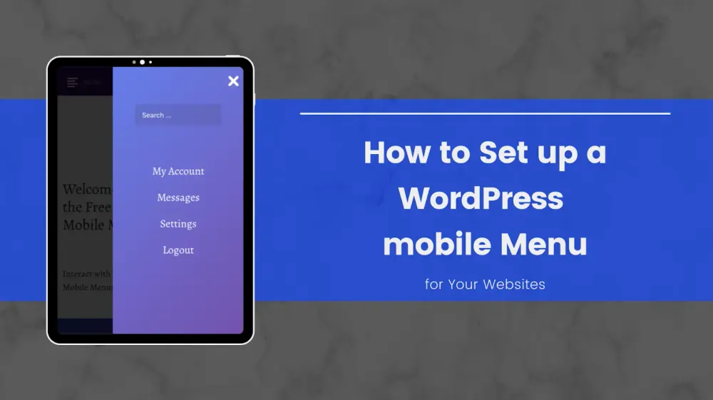
How to Set up a WordPress Mobile Menu for Your Websites?
Do you want to create a WordPress mobile menu for your websites? Mobile users have surpassed desktop users for a lot of sites. They can navigate your sites much quicker just by adding a mobile menu.
This article will show you different ways to create a mobile menu on WordPress. We will cover both the plugin method for beginners and the coding method for advanced users.
Later, we will also list some of the best WordPress menu plugins for you to choose from.
Two Ways to Add a WordPress Mobile Menu to Your Websites
Method #1: Add a WordPress Mobile Menu Using Plugins
This method is more effortless and recommended for beginners as it does not require coding knowledge. With this method, you can create a slider hamburger menu on mobiles.
We will use the Responsive Menu in this guide. This is a popular and free WordPress mobile menu plugin. Go ahead and install and activate it.
After activating successfully, the plugin will add a new menu item named 'Responsive Menu' to the WordPress admin bar. Clicking on it will take you to the plugin's setting page.

Here, you need to enter the screen width, at which resolution the plugin will start displaying the mobile menu, into the 'Breakpoint' field. The default value of 800px should work for most sites.
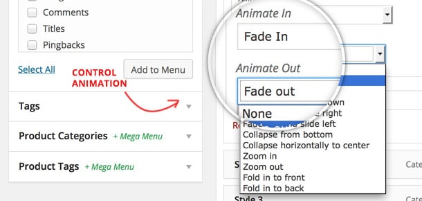
Then, you need to select the menu you want to use for your mobile menu in the Menu to Use section. If you have not created a menu yet, you can create one by going to Appearance > Menus.
The last option on the page is to provide a CSS class of your current non-mobile menu to hide it on smaller screens. This can be a bit complicated if you know nothing about CSS.
Do not forget to click on the Update Options button to save your settings.
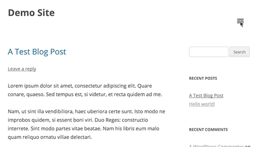
You can now visit your WordPress website and resize the browser windows to see the mobile menu in action.

Method #2: Add a WordPress Mobile Menu without Using Plugins
This method requires you to add code to the WordPress theme files. It is just a different way to accomplish the same result as method #1.
First, you need to open a plain text editor like Notepad to add the following code to an empty text file.
(function($) {
$('#toggle').toggle(
    function() {
        $('#popout').animate({ left: 0 }, 'slow', function() {
            $('#toggle').html('<img src='http://[your domain name]/wp-content/themes/[your theme]/images/menu.png' alt='close' />');
        });
    },
    function() {
        $('#popout').animate({ left: -250 }, 'slow', function() {
            $('#toggle').html('<img src='http://[your domain name]/wp-content/themes/[your theme]/images/menu.png' alt='close' />');
        });
    }
);
})(jQuery);
Do not forget to replace the 'your theme' text with your actual theme directory and the 'your domain name' text with your own domain name. Next, save this file as 'slidepanel.js'.

Now, you need an image that will be used as the menu icon. Most people choose a hamburger icon in this case. You can find many such images from numerous sites, such as the Google Material icons library. After finding out an image you want to use, save it as 'menu.png'.
Next, you need an FTP client to connect to your website server through the FTP protocol. We recommend using FileZilla.
After connecting to your server successfully, upload the 'slidepanel.js' file to the '/wp-content/[your theme]/js/' directory.
If the JS folder is not a thing, you need to create it. Then upload the file.
After that, you need to upload the 'menu.png' file to the '/wp-content/themes/your-theme/images/' directory.
After the files are uploaded, you need to ensure that your theme loads the JS file you just added by enqueuing it. Add the code below to your theme's 'functions.php' file.
wp_enqueue_script( 'wpb_slidepanel', get_template_directory_uri() . '/js/slidepanel.js', array('jquery'), '20211230', true );Now, to display the navigation menu, open the theme's 'header.php' file and look for code similar to this:
<?php wp_nav_menu( array( 'theme_location' => 'primary', 'menu_class' => 'nav-menu' ) ); ?>To display the mobile menu on smaller screens, wrap the code above with this HTML code:
<div id='toggle'>
<img src='http://[your domain name]/wp-content/themes/[your theme]/images/menu.png' alt='Show' /></div>
<div id='popout'>
<?php wp_nav_menu( array( 'theme_location' => 'primary', 'menu_class' => 'nav-menu' ) ); ?>
</div>
At this point, the theme's navigation menu will still be visible on smaller screens. We just wrapped it around the HTML code to enable the mobile menu.
The final step is to add CSS code to hide the menu icon on larger screens. You will also need to adjust the position of the menu icon.
Here is a sample CSS code you can use as a starting point. Note that you may need to adjust the code to avoid conflicts.
/* Navigation Menu */
.main-navigation {
    margin-top: 24px;
    margin-top: 1.714285714rem;
    text-align: center;
}
.main-navigation li {
    margin-top: 24px;
    margin-top: 1.714285714rem;
    font-size: 12px;
    font-size: 0.857142857rem;
    line-height: 1.42857143;
}
.main-navigation a {
    color: #5e5e5e;
}
.main-navigation a:hover,
.main-navigation a:focus {
    color: #21759b;
}
.main-navigation ul.nav-menu,
.main-navigation div.nav-menu > ul {
    display: none;
}

.main-navigation ul.nav-menu.toggled-on,
.menu-toggle {
    display: inline-block;
}

// CSS to use on mobile devices

@media screen and (min-width: 600px) {

.main-navigation ul.nav-menu,
    .main-navigation div.nav-menu > ul {
        border-bottom: 1px solid #ededed;
        border-top: 1px solid #ededed;
        display: inline-block !important;
        text-align: left;
        width: 100%;
    }
    .main-navigation ul {
        margin: 0;
        text-indent: 0;
    }
    .main-navigation li a,
    .main-navigation li {
        display: inline-block;
        text-decoration: none;
    }
    .main-navigation li a {
        border-bottom: 0;
        color: #6a6a6a;
        line-height: 3.692307692;
        text-transform: uppercase;
        white-space: nowrap;
    }
    .main-navigation li a:hover,
    .main-navigation li a:focus {
        color: #000;
    }
    .main-navigation li {
        margin: 0 40px 0 0;
        margin: 0 2.857142857rem 0 0;
        position: relative;
    }
    .main-navigation li ul {
        margin: 0;
        padding: 0;
        position: absolute;
        top: 100%;
        z-index: 1;
        height: 1px;
        width: 1px;
        overflow: hidden;
        clip: rect(1px, 1px, 1px, 1px);
    }
    .main-navigation li ul ul {
        top: 0;
        left: 100%;
    }
    .main-navigation ul li:hover > ul,
    .main-navigation ul li:focus > ul,
    .main-navigation .focus > ul {
        border-left: 0;
        clip: inherit;
        overflow: inherit;
        height: inherit;
        width: inherit;
    }
    .main-navigation li ul li a {
        background: #efefef;
        border-bottom: 1px solid #ededed;
        display: block;
        font-size: 11px;
        font-size: 0.785714286rem;
        line-height: 2.181818182;
        padding: 8px 10px;
        padding: 0.571428571rem 0.714285714rem;
        width: 180px;
        width: 12.85714286rem;
        white-space: normal;
    }
    .main-navigation li ul li a:hover,
    .main-navigation li ul li a:focus {
        background: #e3e3e3;
        color: #444;
    }
    .main-navigation .current-menu-item > a,
    .main-navigation .current-menu-ancestor > a,
    .main-navigation .current_page_item > a,
    .main-navigation .current_page_ancestor > a {
        color: #636363;
        font-weight: bold;
    }
    .menu-toggle {
        display: none;
    }

}
Top 5 Best WordPress Mobile Menu Plugins You Should Use
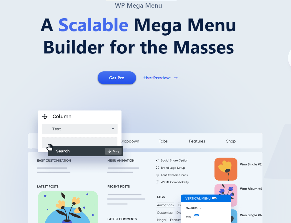
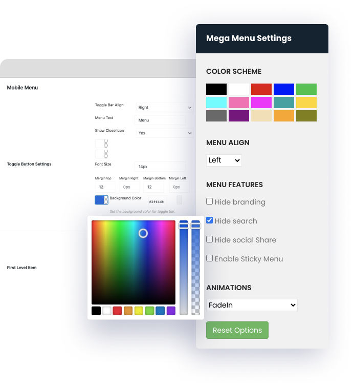
WP Mega Menu from MyThemeShop
- Price: $29
- Ratings: 4.5/5 (339 reviews)
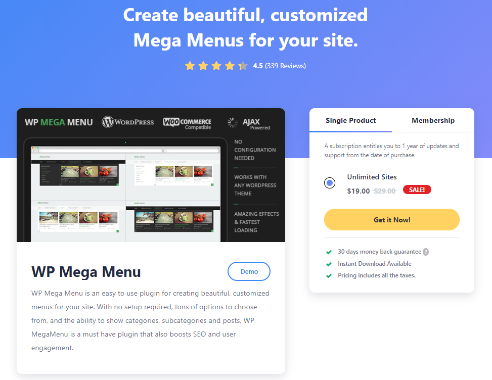
WP Mega Menu is one of the best WordPress responsive menu plugins that helps you add beautiful desktop and mobile menus to your website.
With this plugin, you can easily add categories, subcategories, and posts to the menu. Therefore, your users can discover your best work quickly.

It has several loading effects and layouts for you to choose from. You also have millions of background color options. And if you want, you can use an image for the background.
With lots of other great features, this plugin can give your website a stylish and unique look.
Responsive Menu
- Price: from $49 (free version available)
- Rating: 4.5/5 (338 reviews)
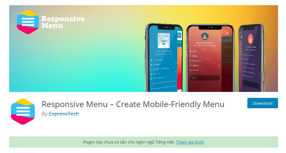
Responsive Menu is a popular free WordPress menu plugin that helps you add an attractive menu to your websites.
Like all the other plugins mentioned in this list, Responsive Menu offers plentiful customization options, such as changing fonts, colors, adding backgrounds, and more.

You can also add a search bar, upload logos, and sub-arrows. It also provides a one-click import/export option to use the same menu on different websites.

UberMenu
- Price: from $25
- Rating: 4.7/5 (4,631 reviews)
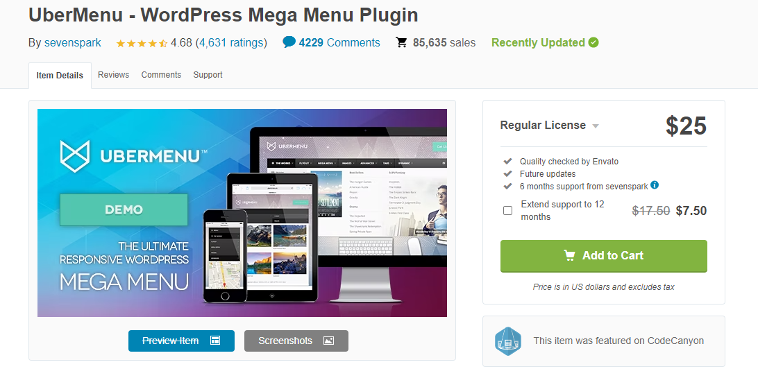
UberMenu is a popular premium desktop and mobile menu plugin available on the CodeCanyon marketplace.
This plugin offers some of the most fantastic customization options that give your menu a stunning look. You can also add images, icons, forms, maps, and more to the menu.

You can also use a tabbed sub-menu where tabs can be oriented top, bottom, left, or right of content panels.

UberMenu is specially optimized for mobile devices and is also cross-browser compatible. With the customizer's live preview, you can quickly change colors, fonts, and more to give your menu the best look.
WP Mobile Menu
- Price: from $6.79/month (free version available)
- Rating: 4.8/5 (236 reviews)

As the name suggests, WP Mobile Menu is a WordPress mobile menu plugin that allows you to create good-looking menus for your websites without writing code.
To engage your users, you can create blank headers, make three levels of menu depth, mask overlays when the menu is open and much more. It also allows you to upload image-based text or logos and add backgrounds.

You can do all of these things with the free version. This plugin also has a premium version with many more customizable options.
For example, you can add a search box directly to the header and footer menus, create a mobile menu displayed only on specific pages, and many more.

WP Mega Menu from Themeum
- Price: from $29/year
- Rating: N/A
This is a popular and stylish WordPress responsive menu builder that is perfect for creating interactive navigation bars. Its drag and drop builder makes your menu creation easy, fun, and flexible at the same time.

You can add columns and row-based menus. And it will automatically save all your changes.
There are loads of customization. Therefore, you can give your website the best look with little effort.
The ready-to-use and pre-made widgets support titles, text, and images. You can also have a text or image-based logo.
Final Thoughts
Just by setting up a WordPress mobile menu for your websites, now your users can navigate your site much quicker.
Therefore, we hope this article has helped you learn how to create a mobile menu in WordPress and choose for yourself an appropriate plugin.
