15 Most High Converting Checkout Page Examples & Practices
The checkout page is one of the most critical parts of your customers' journey through your online store. Shoppers may go through all the procedures before checking out, but if you haven't carefully created the page, you will fail to convert them.
To assist you, in this article, Updimes will present top high-converting checkout page examples and explore some of the best practices for better checkout page designs for both desktop and mobile devices.
This article will cover the following:
- What is a checkout page?
- 2 Main types of checkout page designs
- 8 Checkout page examples
- 7 Best practices for high-converting checkout pages
What Is A Checkout Page?
A checkout page on an eCommerce website is the page where the transaction is completed. This is where the customer pays and provides the information needed for delivery, as well as contact information for invoicing.
Because cart abandonment is common in online businesses, it's critical to make the checkout page as straightforward and user-friendly as feasible. A checkout page should help the shopper feel confident in their purchase by displaying the logos of relevant assurance and guarantee organizations. Displaying numerous payment alternatives clearly early in the checkout process encourages visitors to continue since they know their mode of payment will be approved.
2 Main Types of Checkout Page Designs?
Single Page Checkout
A single page checkout page, as the name implies, is a single page that allows customers to enter their information, such as credit card information, view an overview of their purchasing, and checkout all from one page.
Instead of requiring visitors to go through numerous processes, the single page checkout displays all payment methods and the shipping address on a single page. If you are an online store looking to make your checkout process more user-friendly and convenient, single page checkout is a great alternative.
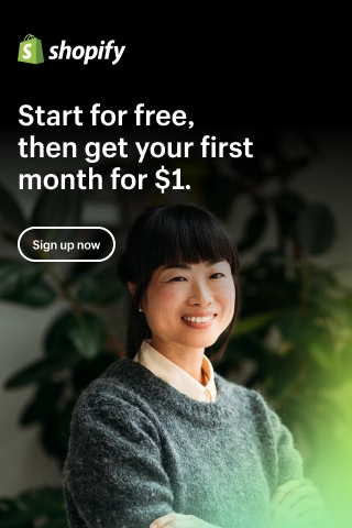
You can easily create a single checkout page if you are creating your online shop with Shopify. Just pay $1 for each month for your first 3 months.
Multi-page Checkouts
Multi-step checkout pages, also known as multi-page checkouts, are those that require clients to go through numerous pages before completing their purchase. Each page is intended to collect specific information required to complete the order. As the owner of an eCommerce firm, you must ensure that each page has been thoroughly optimized for conversions.
This method isn't as prevalent as one-page checkout because it's widely assumed that shoppers abandon their carts when they have more time to ponder about their upcoming purchases.
Which checkout page design should you choose?
The biggest issue with single checkout pages is that they might be difficult to lay out. It can be tough to show all the information to the consumer and collect all the necessary information from them on a single page. A single checkout page can quickly become busy and difficult to use.
Multiple checkout pages provide the benefit of collecting data during the checkout process. If a user is prompted to input their contact information on the initial page and later abandons the purchase, their email address has already been acquired. With this information, the merchant can always contact the consumer and persuade them to finish their transaction.
In general, online buyers prefer a single checkout page to multiple pages. A single page with all the fields the customer must fill out will make it simpler for them to understand how the entire process works and increase their likelihood of making a purchase. However, when properly configured, multi-page checkouts are just as effective as single-page checkouts and can considerably enhance conversions on your eCommerce site.
8 Checkout page examples
Walmart Single Page Checkout
Walmart's single-page checkout design simplifies the checkout process by displaying all the necessary fields and steps on a single page. Walmart allows customers to add products to their shopping cart, but they need to sign up for a Walmart account if they want to proceed to the checkout process.
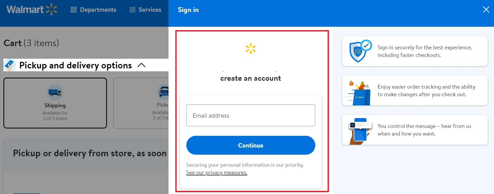
This eCommerce store separated the one-page checkout process into three stages so that visitors didn't have to fill out a single long form. The page includes a summary of the order, billing and shipping information, payment options, and order review.
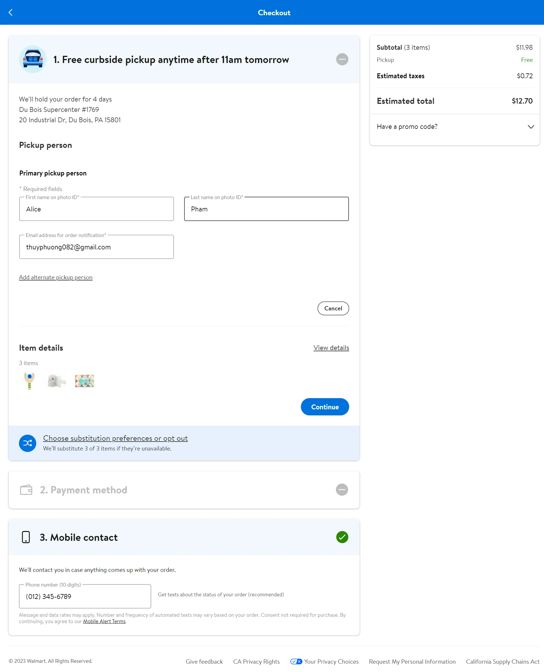
This one page checkout example is visually appealing, with clear and concise instructions, and is optimized for mobile devices. The use of bright and contrasting colors makes the call-to-action buttons stand out, encouraging customers to complete the purchase.
Nike Checkout Page
Nike features a sleek and minimalist checkout page design that emphasizes the brand's identity. This platform also offers a minimalist three-step checkout screen. When you fill out a form, you'll see a green checkmark if your input is acceptable and an error notice if it isn't.
You can choose from a variety of payment options, which is a great strategy for increasing conversions because it allows customers to choose the easiest method.
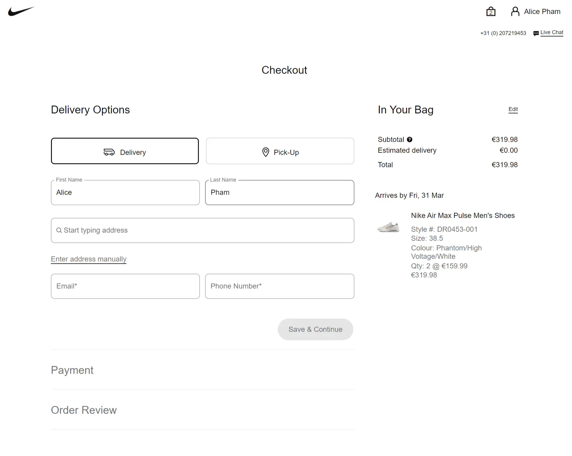
The page includes smooth checkout progress that requires customers to complete the first step, then push them to the second step, and then the third step. The page also features a summary of the order, shipping and billing information, payment options, and order review. Nike's checkout page uses a lot of white space, making the page feel open and uncluttered.
Best Buy Checkout Design
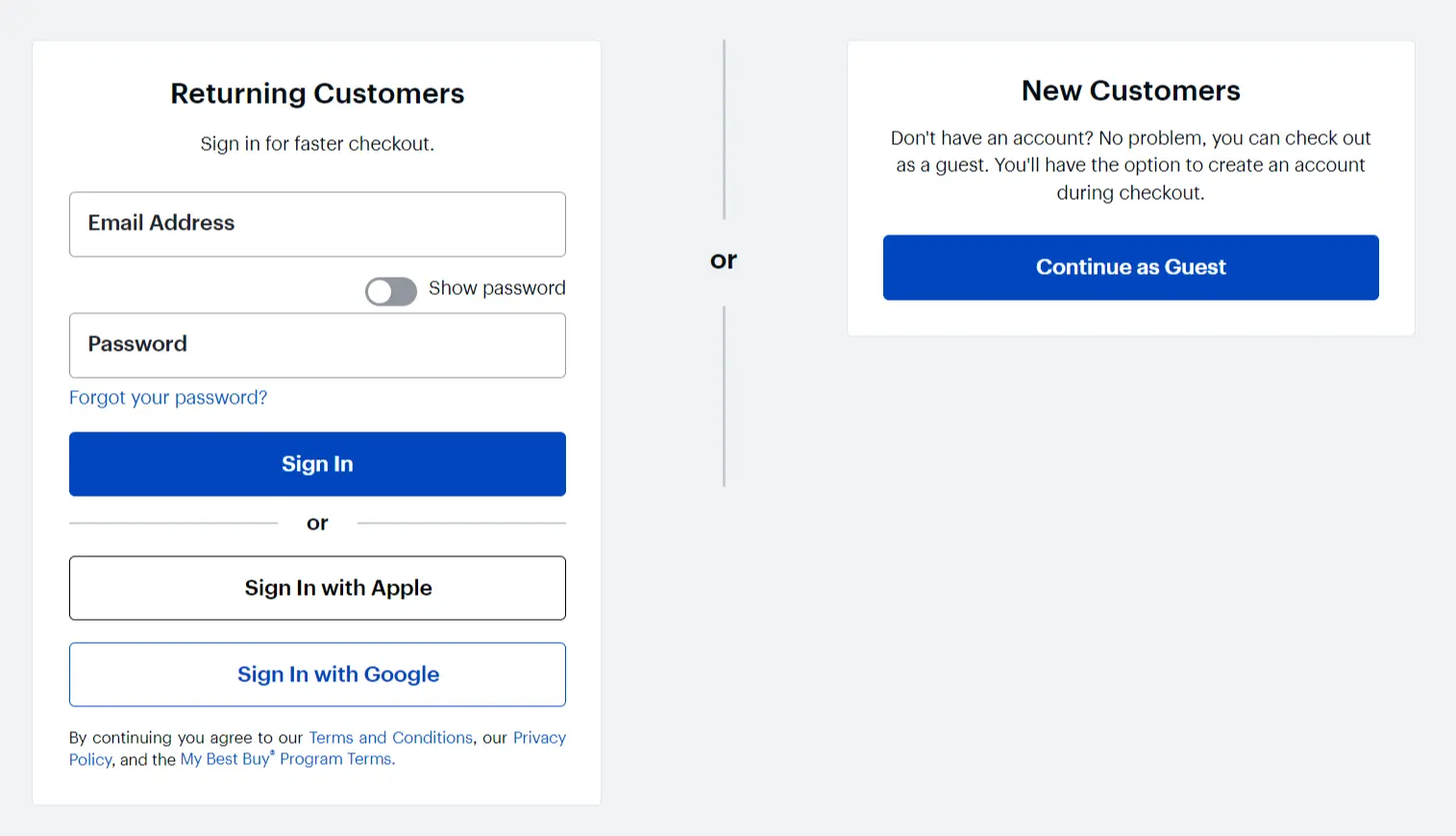
Best Buy offers customers to check out as a guest if they do not want to create an account.
Best Buy's checkout design features a modern multi-page checkout design with a focus on simplicity and ease of use. This checkout page design example includes a progress bar to show the shopper where they are in the process. Users can also browse between checkout steps by using the progress indicator.
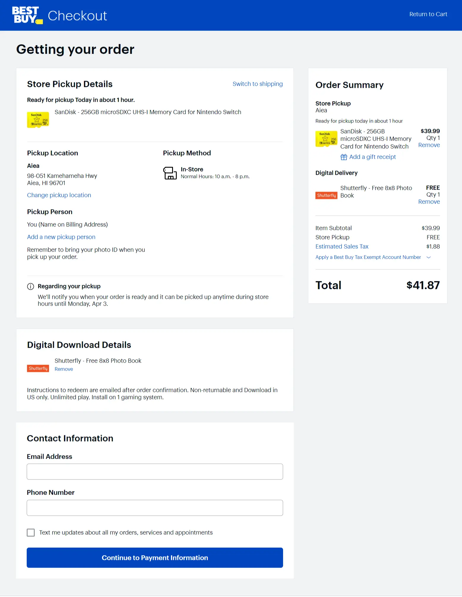
This is one of the best 1-page checkout examples that covers a summary of the order, shipping and billing information, payment options, and an order review. Best Buy's checkout page also features a gift card or discount code input field, making it easy for customers to redeem their rewards.
This single-page checkout example uses a lot of white space, making it feel open and spacious, with clear call-to-action buttons.
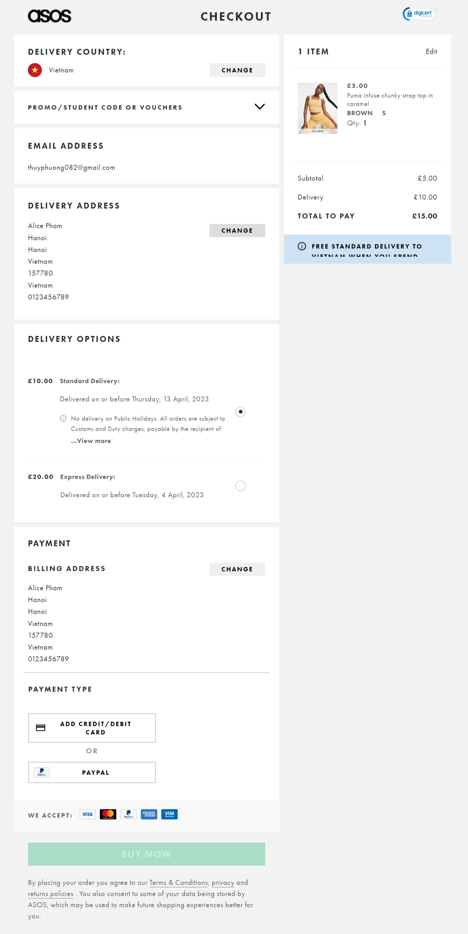
ASOS Checkout Page
ASOS offers a checkout page design that is clean and modern, with a focus on simplicity and ease of use. This checkout page example can remove all distractions because it includes 6 small steps, including Delivery country, Promos code/ voucher, Email address, Delivery address, Delivery options, and Payment information.
Like other eCommerce checkout pages, this page also features a summary of the order, with the option to add or remove items from the cart. ASOS's checkout page is optimized for mobile devices, with a responsive design that adjusts to the screen size. The use of bright and contrasting colors makes the call-to-action buttons stand out, encouraging customers to complete the purchase. Moreover, the trust signal in the upper-right corner can push the customers to make purchases quickly.
Etsy Multiple Checkout Template
Etsy offers guest checkout as the primary option to provide a better customer experience.
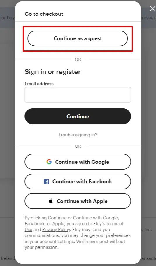
Etsy's multiple checkout template features a simple multi-page design that breaks the checkout process into 3 steps that includes a summary of the order, shipping and billing information, payment options, and order review. There is a progress indicator to inform the clients at which step they are.
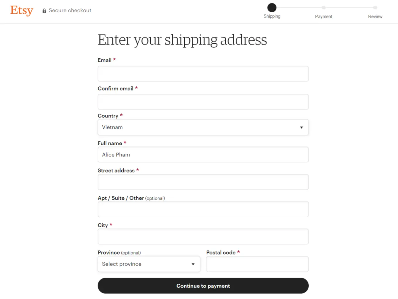
Etsy's checkout template also includes a gift card or discount code input field, making it easy for customers to redeem their rewards. The use of clear and concise instructions, along with visual cues, makes the checkout process simple and easy to follow.
Casper Shopping Cart Design
Casper's shopping cart design features a minimalist and modern design, with a focus on simplicity and ease of use. The shopping cart includes a summary of the order, with the option to add or remove items from the cart. The checkout page includes a progress bar, shipping and billing information, payment options, and order review. Casper's shopping cart design is optimized for mobile devices, with a responsive design that adjusts to the screen size.
Maplin Checkout Page Design
Maplin allows their customers to check out without creating an account. Maplin offers a multi-step checkout page, but it focuses on simplicity and ease of use.
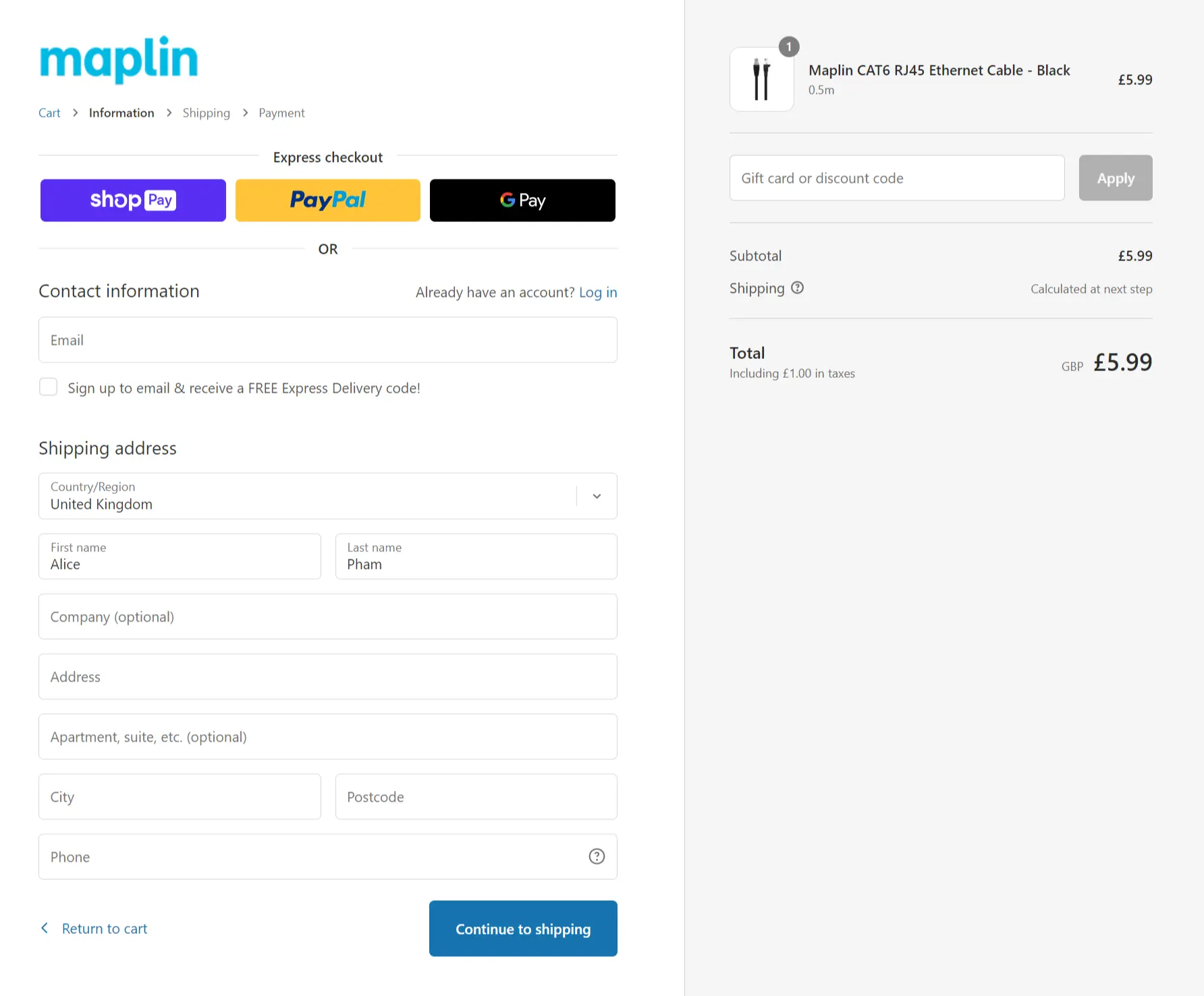
The checkout page includes a progress breadcrumb, a summary of the order, shipping and billing information, payment options, and an order review. Maplin's checkout page also features a gift card or discount code input field, making it easy for customers to redeem their rewards. The page uses a lot of white space, making it feel open and uncluttered, with clear call-to-action buttons.
Apple Checkout Process
Apple allows customers to check out as guests. There is nothing additional on this checkout page design example. Like other checkout page examples, Apple’s checkout process includes a summary of the order, shipping and billing information, payment options, and order review.
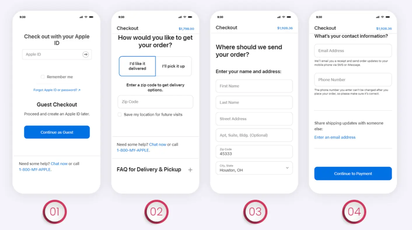
Apple provides no reason for you to abandon your card because there are no distracting elements or extra processes in the design of this company's mobile checkout page. At the bottom of its checkout page template, there is a list of commonly asked questions, a chat button, and a call button for customers to ask further questions about products before completing the purchasing process. That may improve the user experience.
7 Best Practices For High Converting Ecommerce Checkout Page
The checkout page is the final and most important step in the customer's buying journey. A high-converting eCommerce checkout page can help boost your conversion rate and increase your revenue. Here are 7 best practices to create a high-converting checkout page:
Allow Guest Checkout
Many customers prefer to checkout as guests rather than create an account. Providing the option for guest checkout can improve the user experience and reduce cart abandonment rates for customers who want to avoid creating an account. Allowing guest checkout gives customers more control over their shopping experience and eliminates any potential friction that may prevent them from completing their purchase.
Add Trust Seals
Trust seals, such as security badges and customer reviews, can help build trust with customers and increase conversion rates by giving customers peace of mind that their purchase is secure. Trust seals help to reduce the customer's anxiety by letting them know that your website is safe to make purchases.
Avoid Unexpected Costs
Being transparent about shipping and tax costs is crucial to avoid surprising customers with unexpected fees at checkout, which can lead to cart abandonment. Display the shipping and tax costs on the product page or in the cart to make it clear to customers what they can expect to pay. You should also avoid charging hidden fees such as handling charges or surcharges.
Provide Excellent Customer Support
Offering multiple channels for customer support, such as chat, email, and phone, helps customers with any issues they may encounter during checkout and builds trust. Providing excellent customer support can help you stand out from your competitors and encourage customers to return for future purchases.
Add A Progress Bar
Including a progress bar can help customers understand how many steps are left in the checkout process, reducing frustration and improving the user experience. A progress bar can make the checkout process more manageable and predictable, reducing customer anxiety and making them more likely to complete their purchase.
Enable Multiple Payment Options
Offering multiple payment options, such as credit cards and PayPal, can improve the checkout experience for customers and increase conversion rates by making it easier for customers to pay. Providing multiple payment options gives customers the flexibility to choose the option that works best for them, increasing the chances of completing the purchase.
Boost Your Page Speed
Boost Your Page Speed: Optimizing images and using a content delivery network (CDN) can improve page speed and reduce load times, leading to a better user experience and reducing cart abandonment rates. A fast checkout page is critical because slow pages can cause customers to become impatient, frustrated, and abandon their cart.
Checkout Page Examples: FAQs:
What should be on a checkout page?
A checkout page should include all the necessary elements to complete a purchase, such as a summary of the order, shipping and billing information, payment options, and order confirmation. It should be easy to navigate, visually appealing, and optimized for mobile devices.
What are the types of checkout page?
There are two main types of checkout pages: multi-page and one-page. Multi-page checkout pages break the checkout process into several steps or pages, while one-page checkout combines all the checkout steps into a single page.
What is 1-page checkout?
One-page checkout, or single-page checkout, is a type of checkout page where all the checkout steps, such as shipping and billing information, payment options, and order confirmation, are combined into a single page. One-page checkout is popular among e-commerce businesses because it simplifies the checkout process, reduces cart abandonment rates, and provides a better user experience.
What are examples of express checkout?
Express checkout options allow customers to complete a purchase with minimal steps and are offered by various payment providers. Examples of express checkout options include PayPal Express Checkout, Amazon Pay, Google Pay, and Apple Pay. Express checkout options simplify the payment process, provide a faster and more convenient checkout experience, and can increase conversion rates.
Final words,
That is all you need to know about excellent checkout page examples and strategies.
You must comprehend your clients' expectations in order to develop a fantastic checkout page, and you must test several concepts. This page needs to be optimized if you want to boost sales. You may construct a simple and frictionless checkout process to get the conversion rate you want by taking into account and putting to use the finest checkout page design guidelines stated above.

![]()